StratoSync is a satellite ISP and VPN technology company built around secure, high-speed global connectivity. I was brought in to create a complete brand identity, digital product experience and Framer website that could make encrypted networking feel faster, clearer and more credible while giving the brand a distinctive presence in a crowded technology market.
Category:
Brand Identity
Industry:
Satellite ISP, VPN & Cybersecurity
Duration:
3 weeks
Client Location:
USA

Challenge
Satellite internet, VPN and cybersecurity brands often communicate through the same visual codes - dark interfaces, generic network graphics and predictable security symbolism. StratoSync needed to signal speed, security and technical capability without becoming another anonymous tech brand.
Trust was equally important. The identity had to feel credible enough for users relying on encrypted connectivity, while remaining distinctive across the VPN product, website and wider brand communications.
Approach
I built the identity around the idea of synchronized connectivity. The StratoSync symbol combines data flow, satellite pathways and geometric precision into a compact mark designed to communicate speed, security and constant connection.
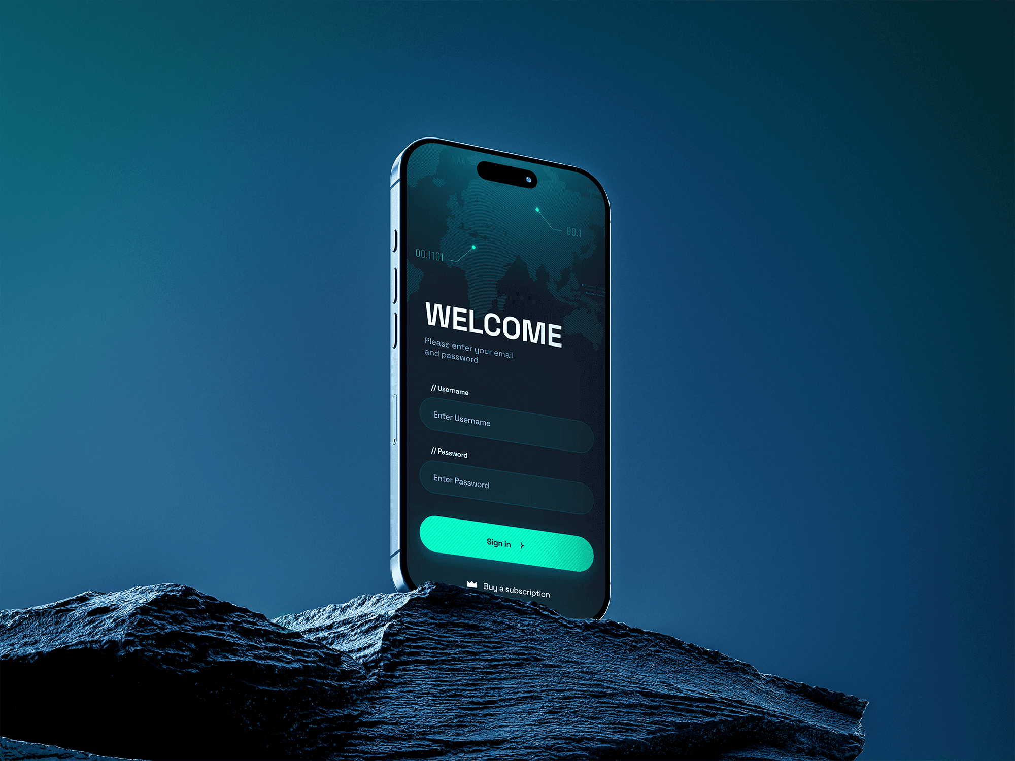
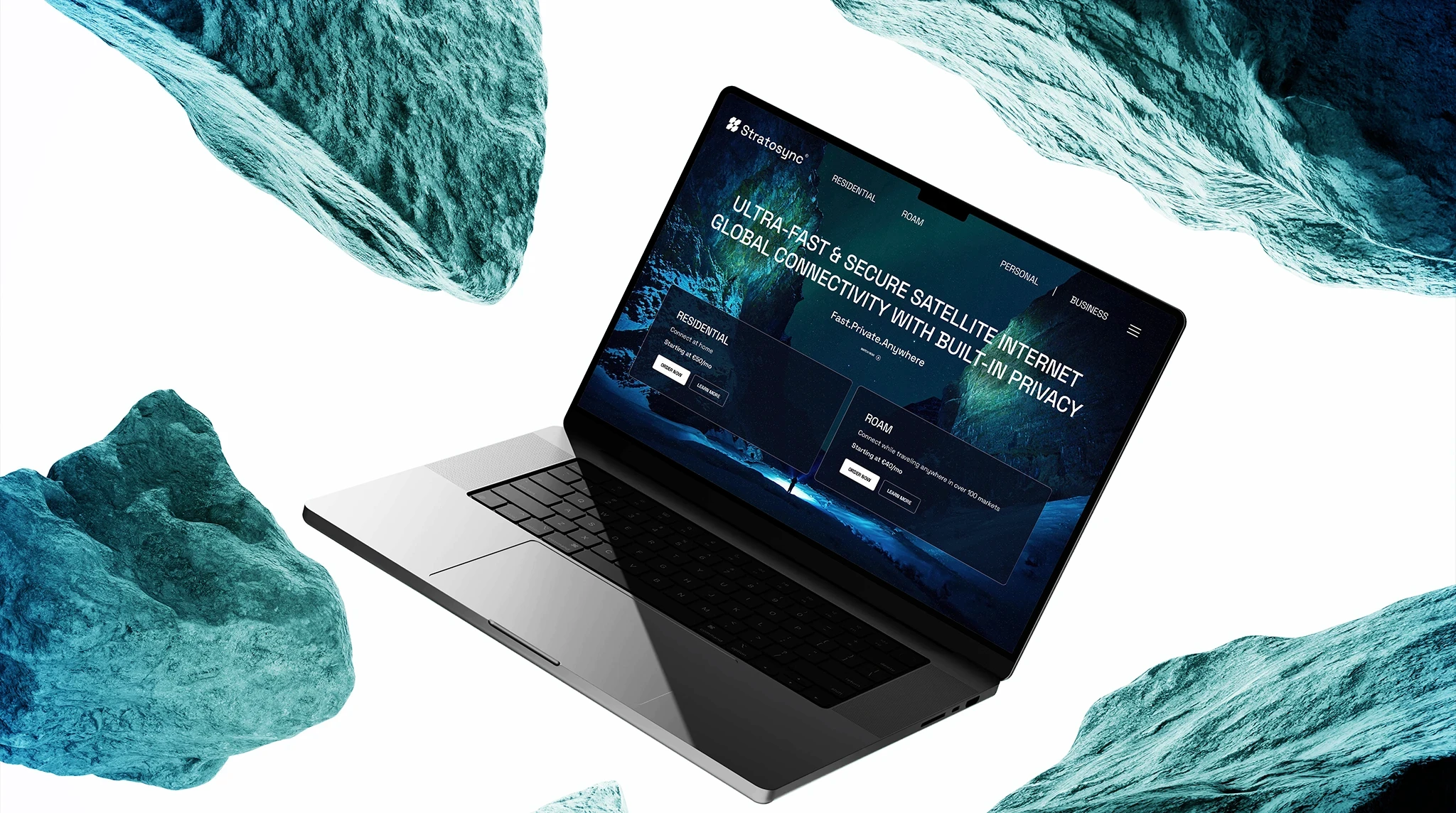
Deep space blue, neon cyan and a high-contrast visual system extended that idea across the brand. Dark-mode UI, glowing accents, encrypted map graphics and clear interaction states carried the identity into the VPN experience, while the Framer website translated the same cues into a fast, focused digital presence built around clarity and conversion.



Outcome
StratoSync came out with a complete technology brand system connecting logo design, visual identity, VPN UI/UX and web design into one recognizable experience. Following the redesign, brand recognition increased by 52%, website conversions rose by 41%, and VPN engagement grew by 29% - giving the brand measurable improvement beyond the visual refresh itself.
Reaction to the new logo was especially strong. The client shared that the mark was receiving impressive feedback from others as well, reinforcing that the new identity was not only more distinctive internally, but noticeably stronger in the market.